

Web Design + Development
RILA LINK Conference Website Redesign
A complete redesign of the RILA LINK Conference website focused on creating a more modern, organized, and user-friendly experience across desktop and mobile.
The Project
Rethinking the conference experience from design to development.
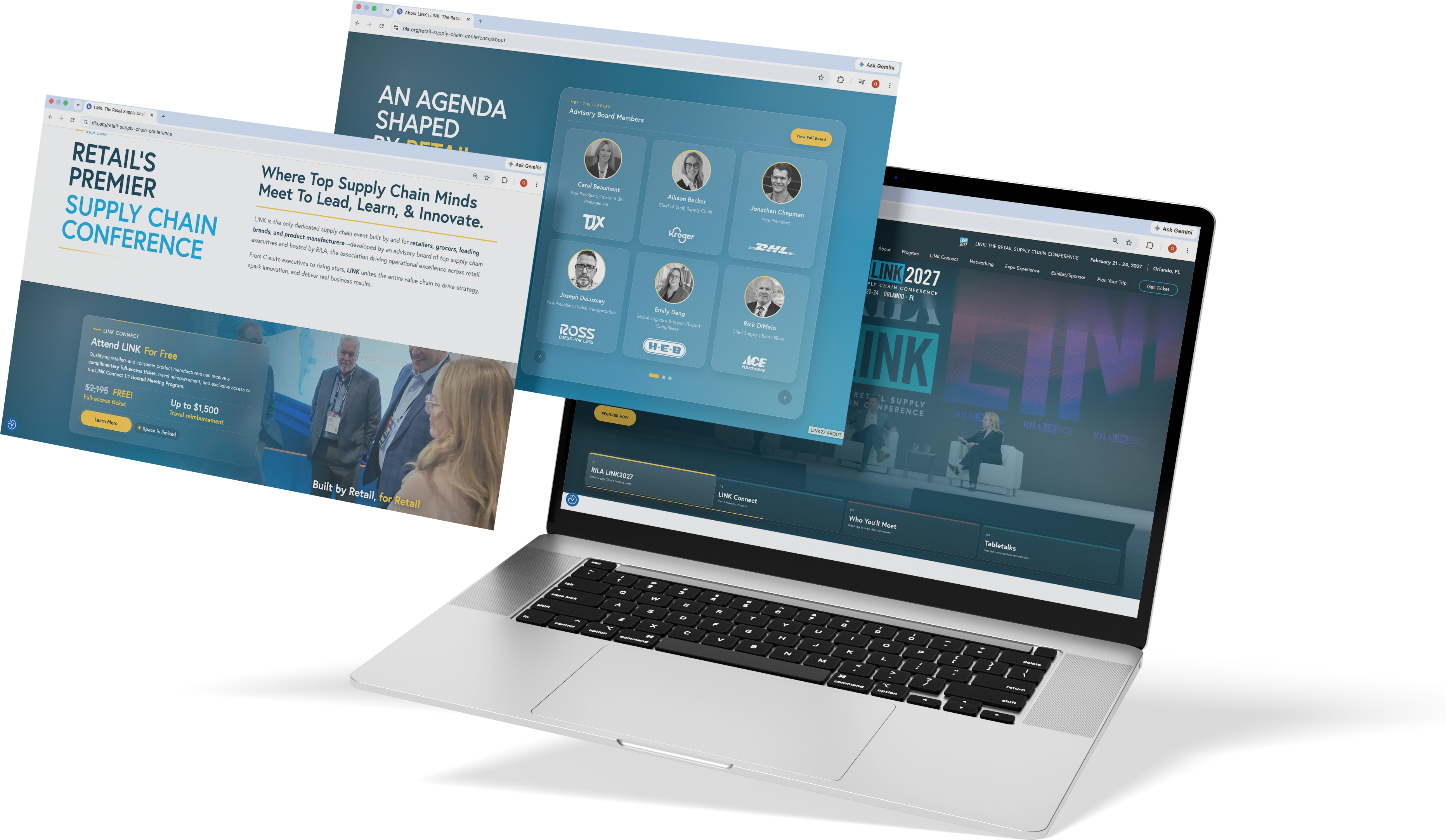
I led the redesign of the RILA LINK Conference website, refreshing the visual direction while improving how attendees navigate and find important conference information.
My work included reorganizing content, strengthening visual hierarchy, improving navigation, and creating a more cohesive experience across desktop, tablet, and mobile.
I also coded and implemented key parts of the redesign, which allowed me to carry the project from visual concept into the final digital experience while keeping the finished site closely aligned with the original design direction.
The Challenge
Creating a clearer and more engaging digital experience.
The previous website lacked a clear visual hierarchy, consistent branding, and an intuitive user experience. Important information about the event, speakers, and schedule was difficult to find, while the mobile experience made navigating the site less efficient for attendees.
My Approach
Visual Hierarchy
Created a clear and organized content structure using strong typography, intentional spacing, and thoughtful page layouts to make important information easier to find, scan, and understand.
Brand Experience
Extended the LINK Conference brand across the website through consistent color, typography, imagery, and visual elements, creating a more cohesive and recognizable digital experience.
Responsive Design
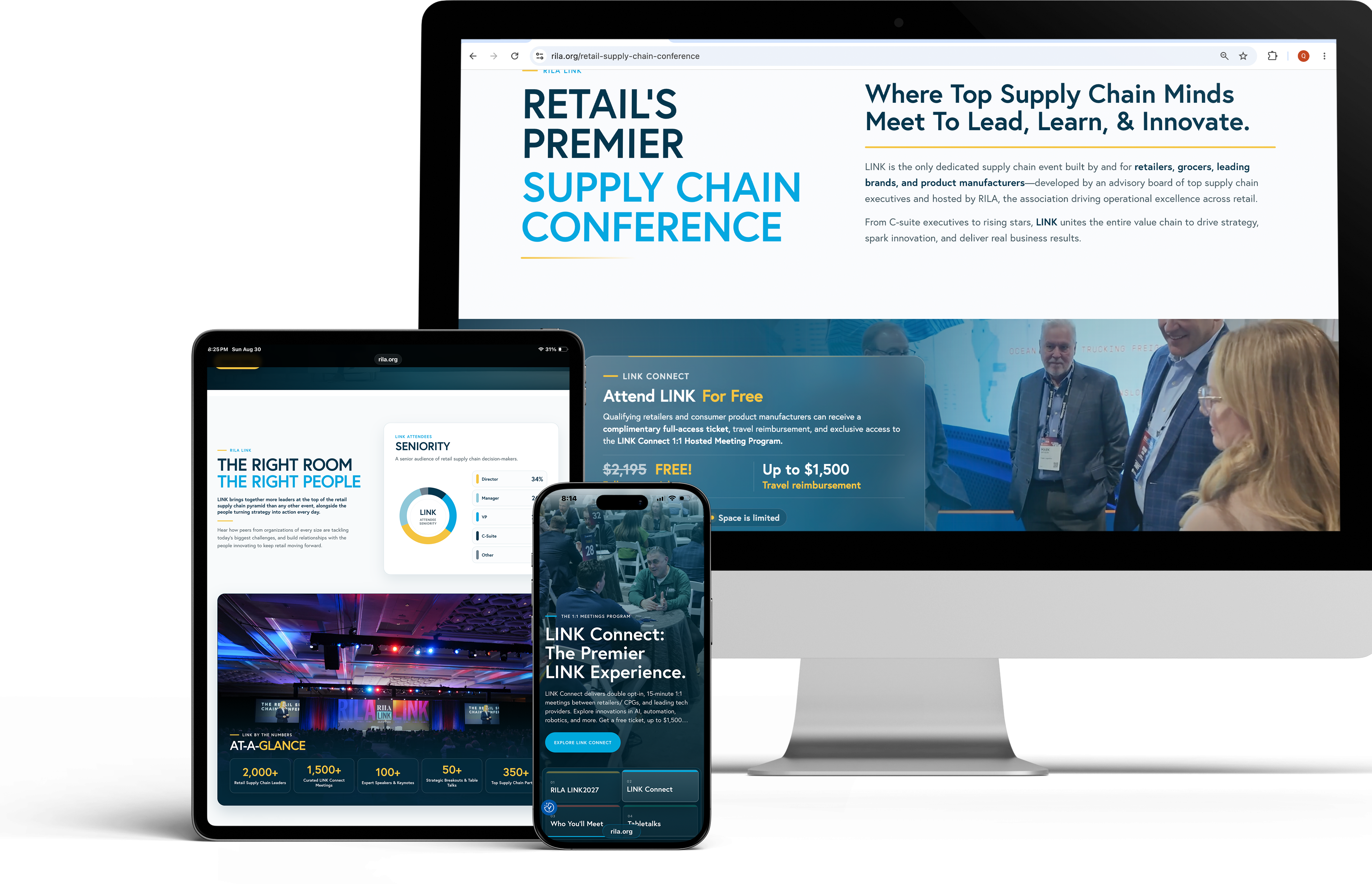
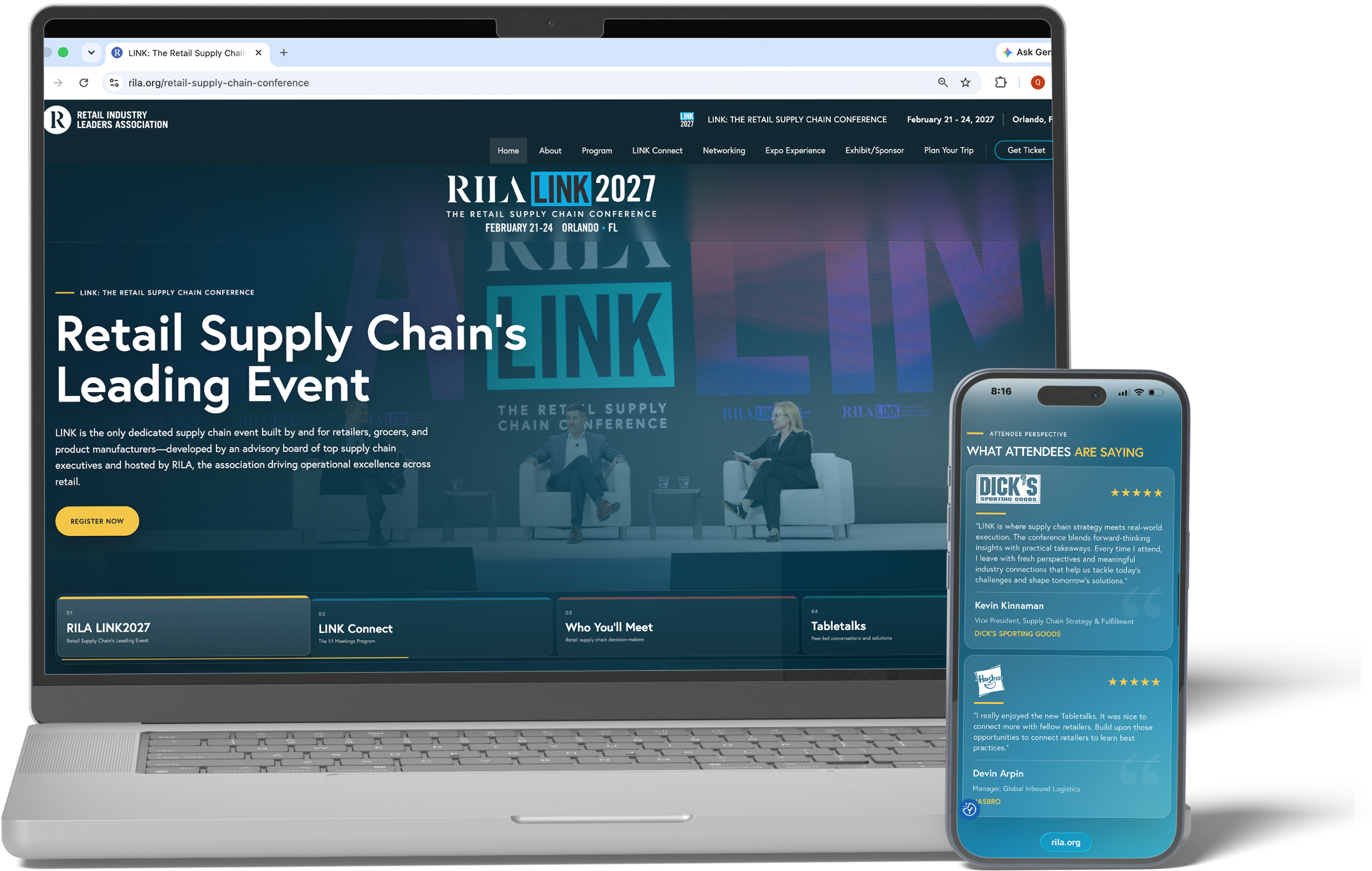
Designed and developed responsive layouts that adapt across desktop, tablet, and mobile devices, providing attendees with a smooth and consistent experience regardless of screen size.
Design Highlights
A closer look at how I improved the LINK Conference website through clearer layouts, stronger branding, and a more intuitive way for attendees to find important information.

Making the Page Easier to Scan
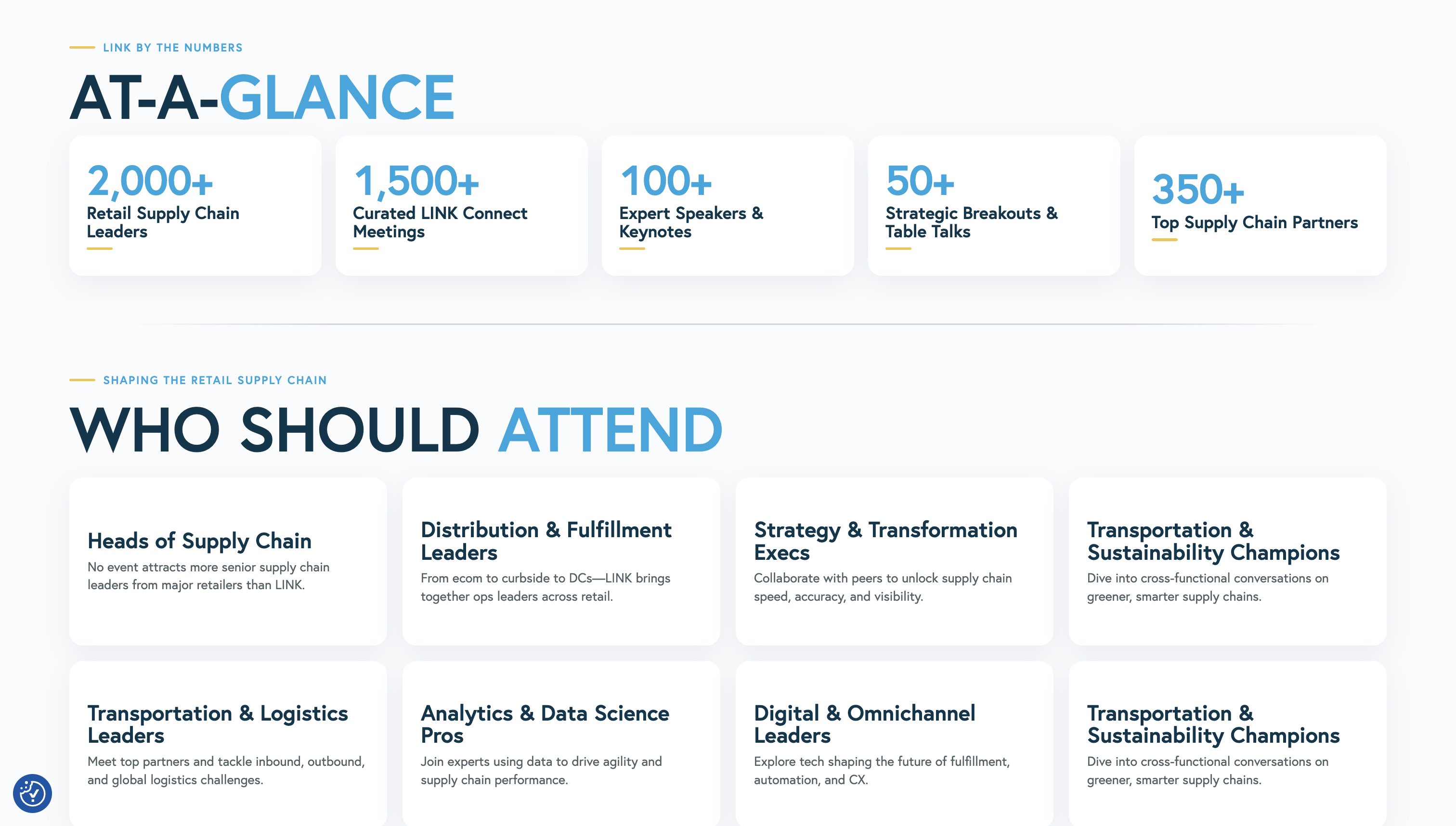
I simplified the visual hierarchy so visitors can understand the page more quickly. Larger headlines, clearer section breaks, and more breathing room help important information stand out without making the experience feel crowded.

Bringing More of LINK Into the Website
I carried more of the conference’s personality into the digital experience through typography, color, imagery, and consistent layouts. The result feels more connected to LINK while remaining clean and easy to navigate.
Making Information Easier to Find
I grouped related content more intentionally and created clearer sections throughout the site. This helps attendees move through the page naturally and reach the information they need faster.
Before & After
A clearer, more cohesive digital experience.
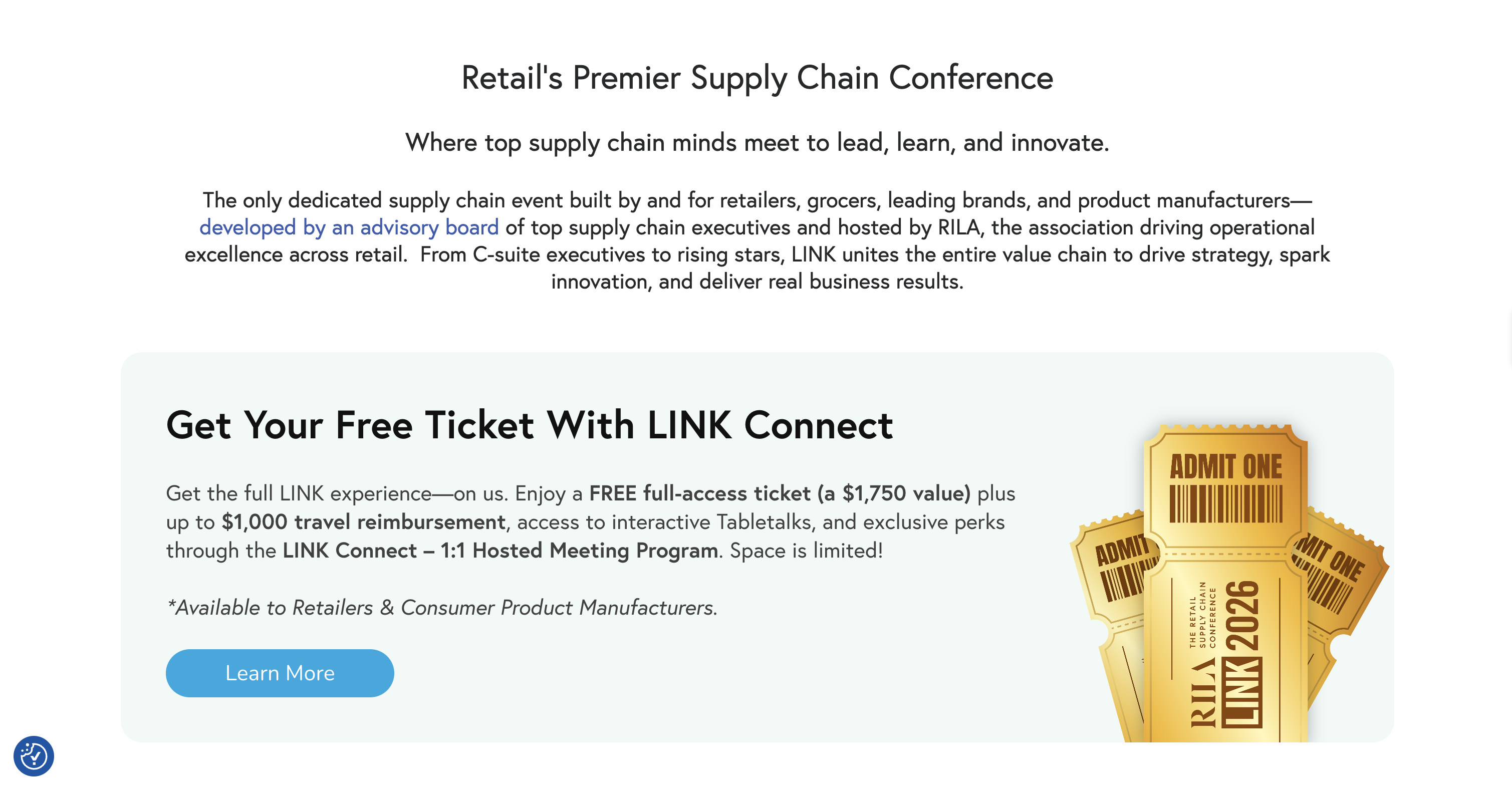
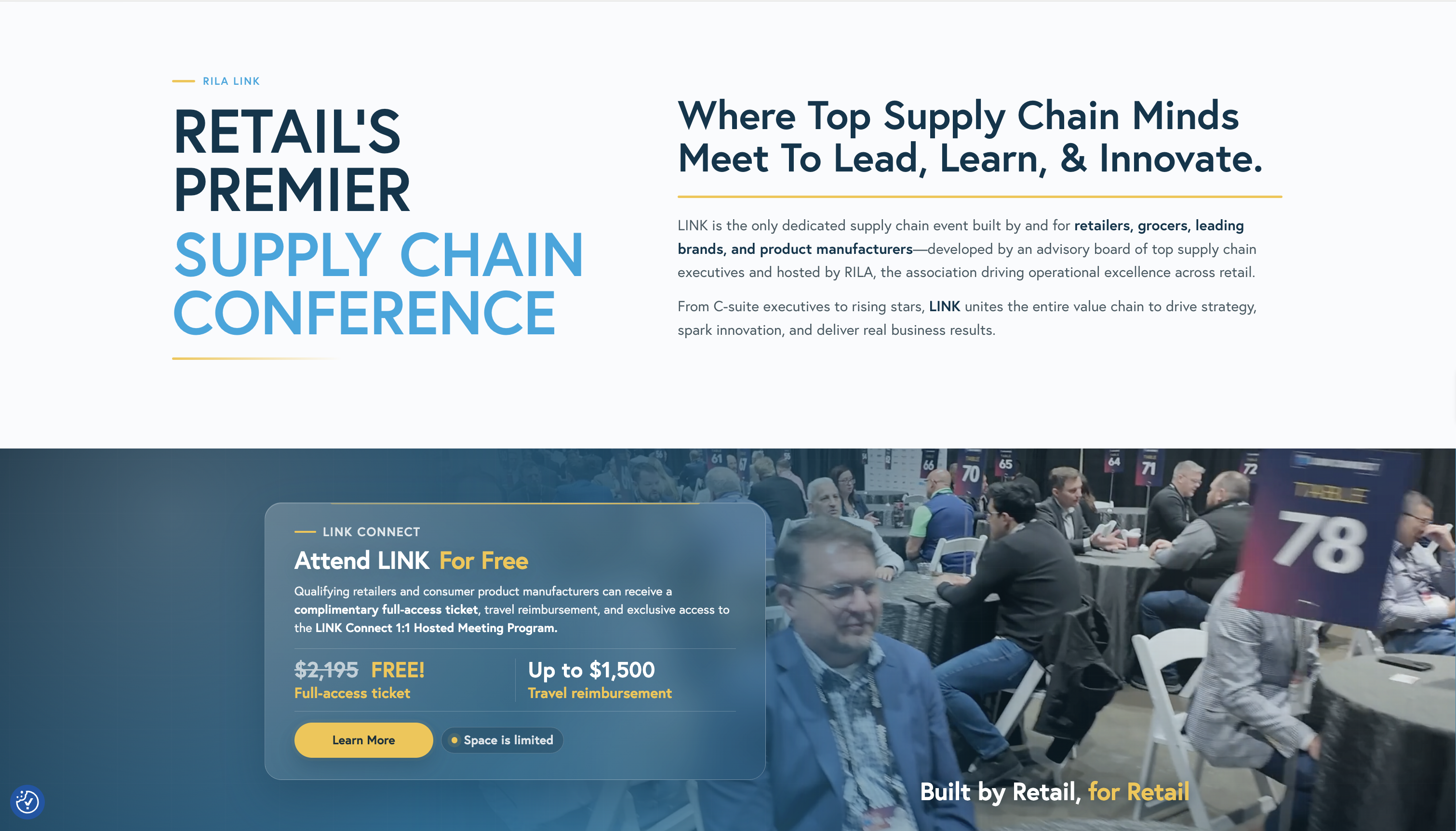
The redesign strengthened the LINK Conference website by improving visual hierarchy, brand consistency, and content organization while creating a cleaner experience across the site.
Responsive Design
The LINK experience was designed to work naturally across desktop, tablet, and mobile. Layouts, typography, spacing, and content adapt across screen sizes so attendees can access the same information clearly and comfortably on any device.
Design to Development
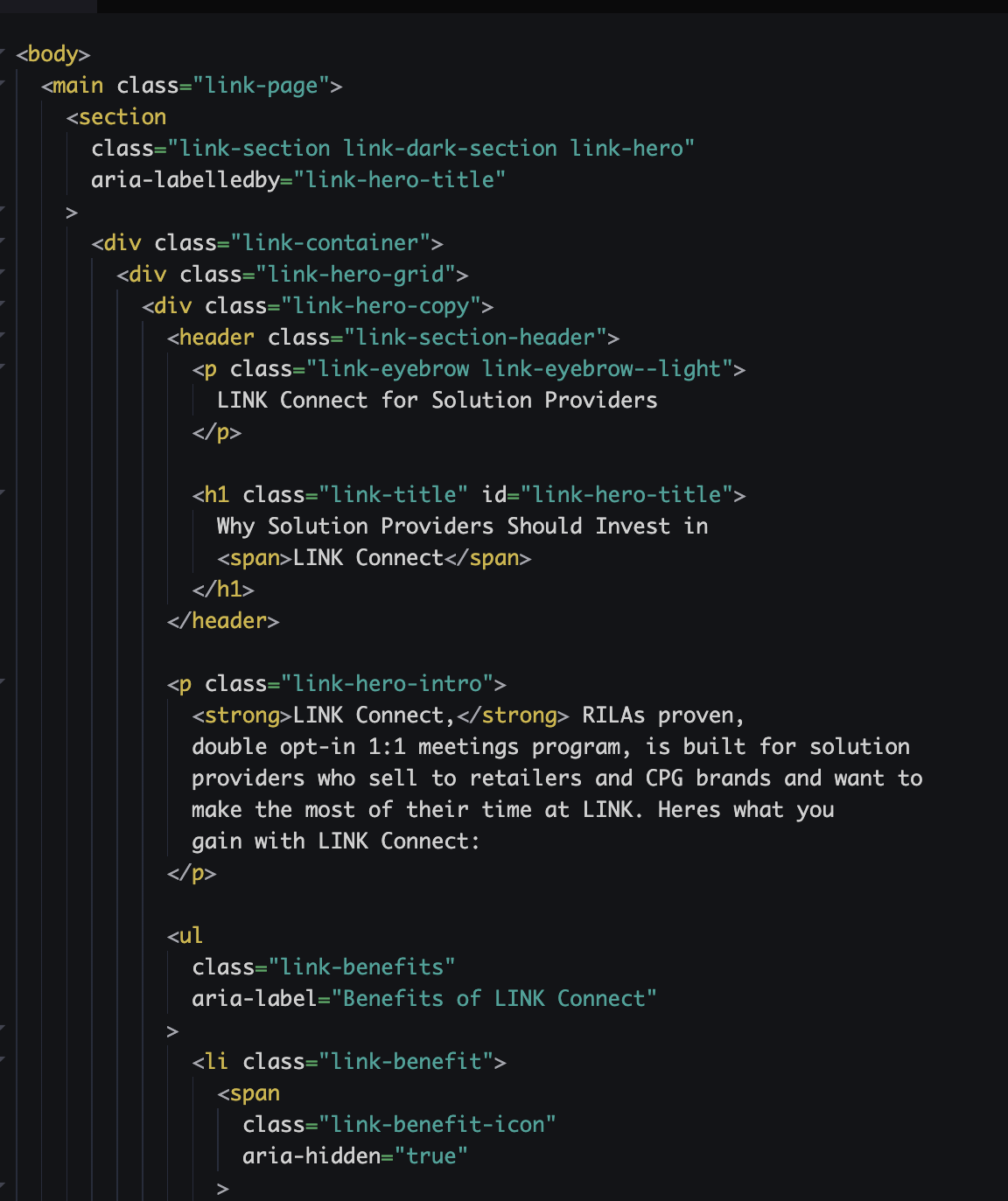
I also translated parts of the redesign directly into code. Working across both design and development allowed me to fine-tune spacing, responsiveness, and layout behavior while keeping the finished site closely aligned with the original visual direction.
Conclusion
More than a visual refresh.
Redesigning the LINK Conference website gave me the opportunity to rethink how the experience worked from both a design and development perspective. I focused on making the site feel more connected to the LINK brand while also making the content easier to move through, especially across different screen sizes.
Being involved in both the design and implementation also meant I could carry ideas all the way from concept to the live website, adjusting the details along the way and making sure the final result still felt true to the original direction.
See the final experience.
Explore the live LINK Conference website to see how the redesign comes together across the full site.