Brand Development + Visual Identity
Ecolete
Ecolete is a conceptual women's activewear brand I created around the idea of making fitness apparel feel more thoughtful about the environment without losing the performance, comfort, and style athletes expect.
The Concept
Building an eco-conscious identity for women's activewear.
I started Ecolete with a pretty simple question: what would an athletic brand look like if sustainability was part of the idea from the very beginning?
I wanted to create something specifically for active women, with a brand personality that could feel strong and performance-focused without becoming too aggressive or overly technical. The concept includes pieces like sports bras, leggings, compression shorts, and shirts, with comfort, durability, and movement all playing into the direction.
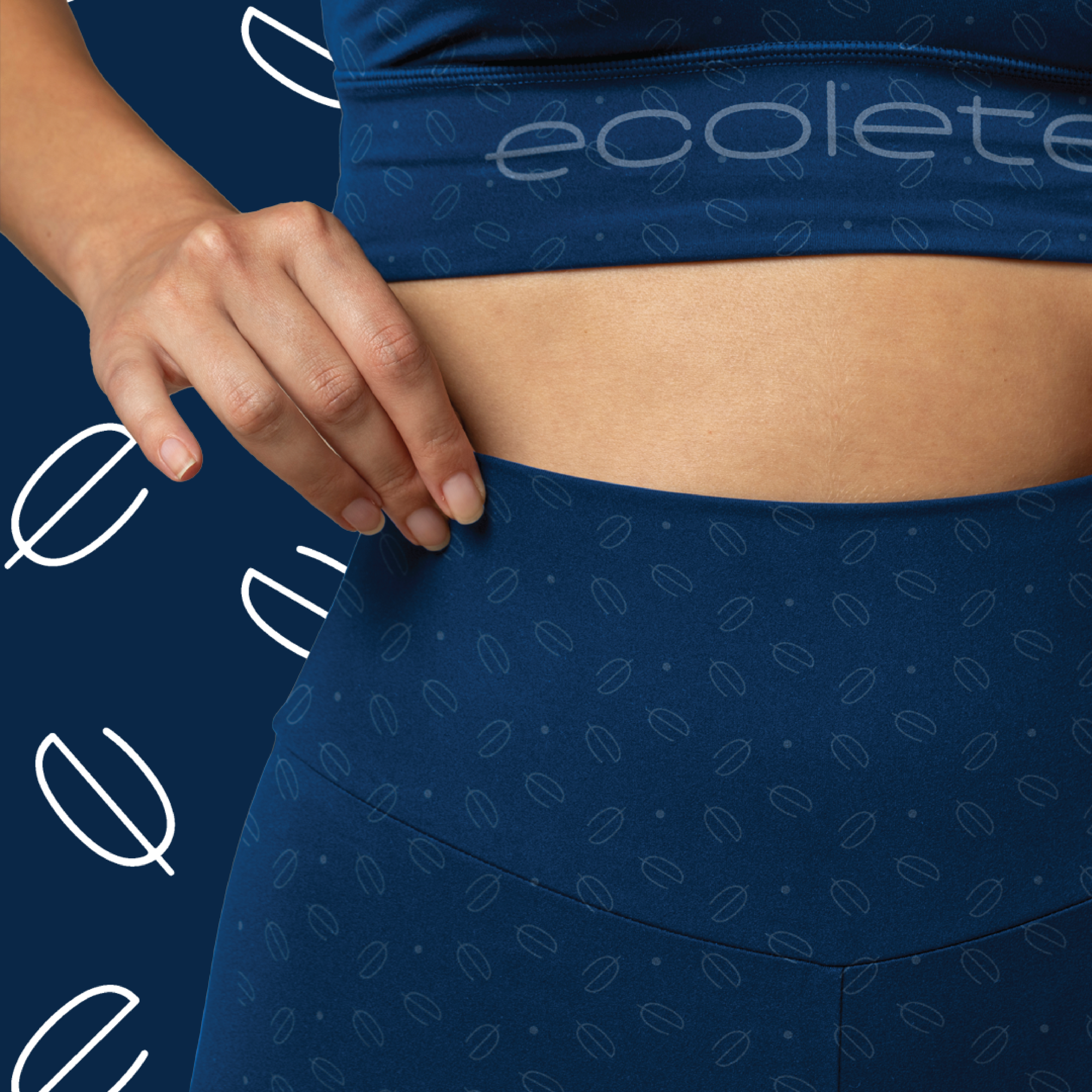
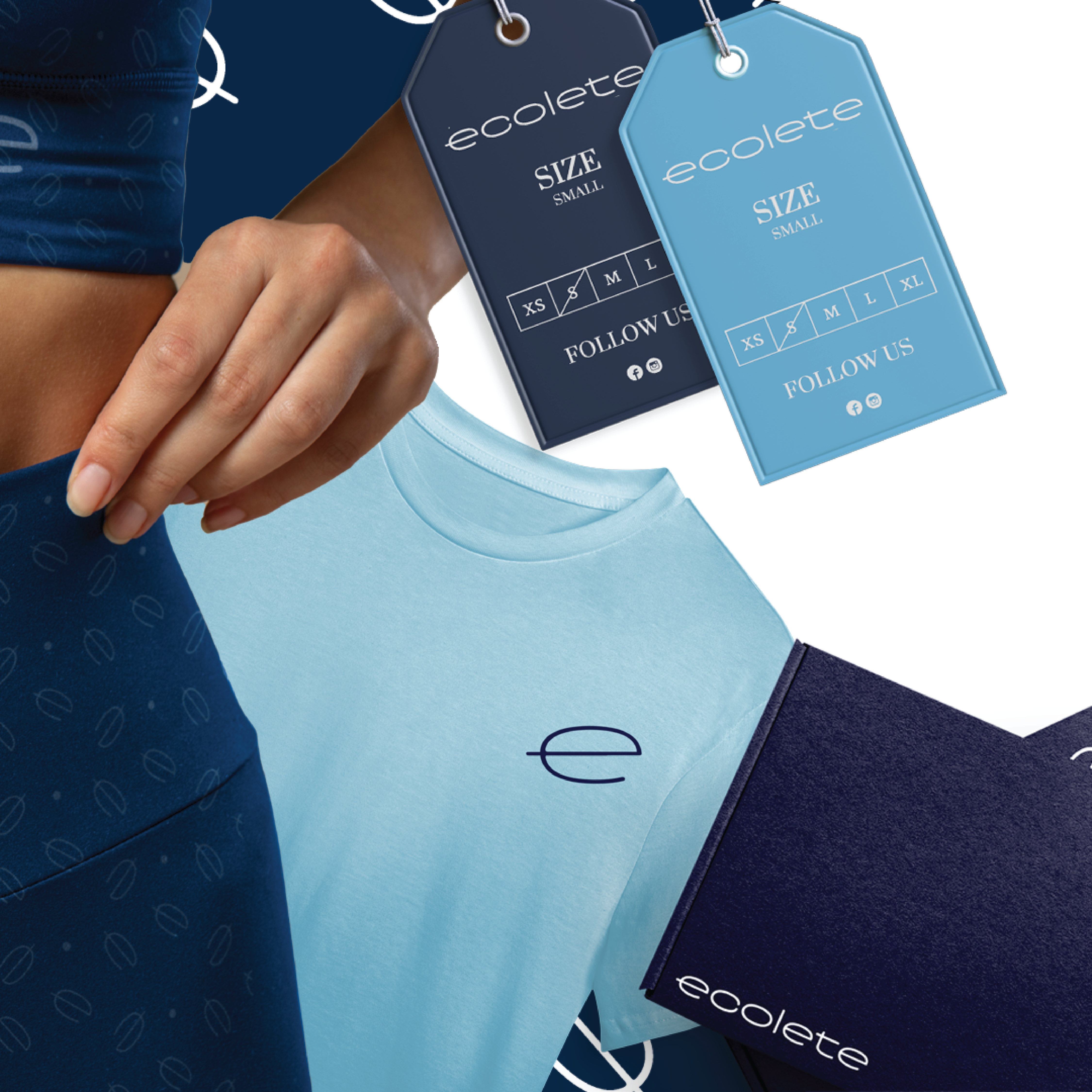
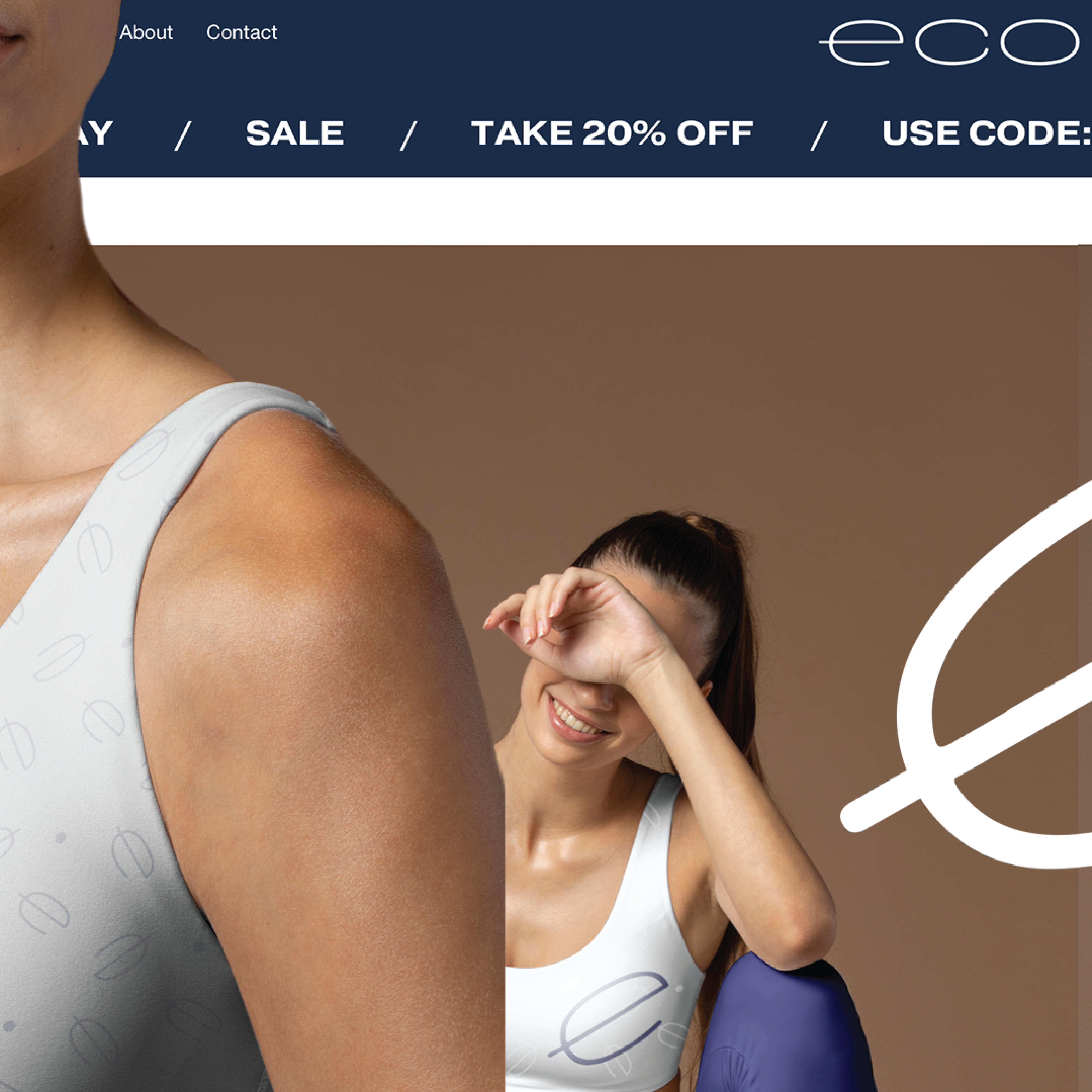
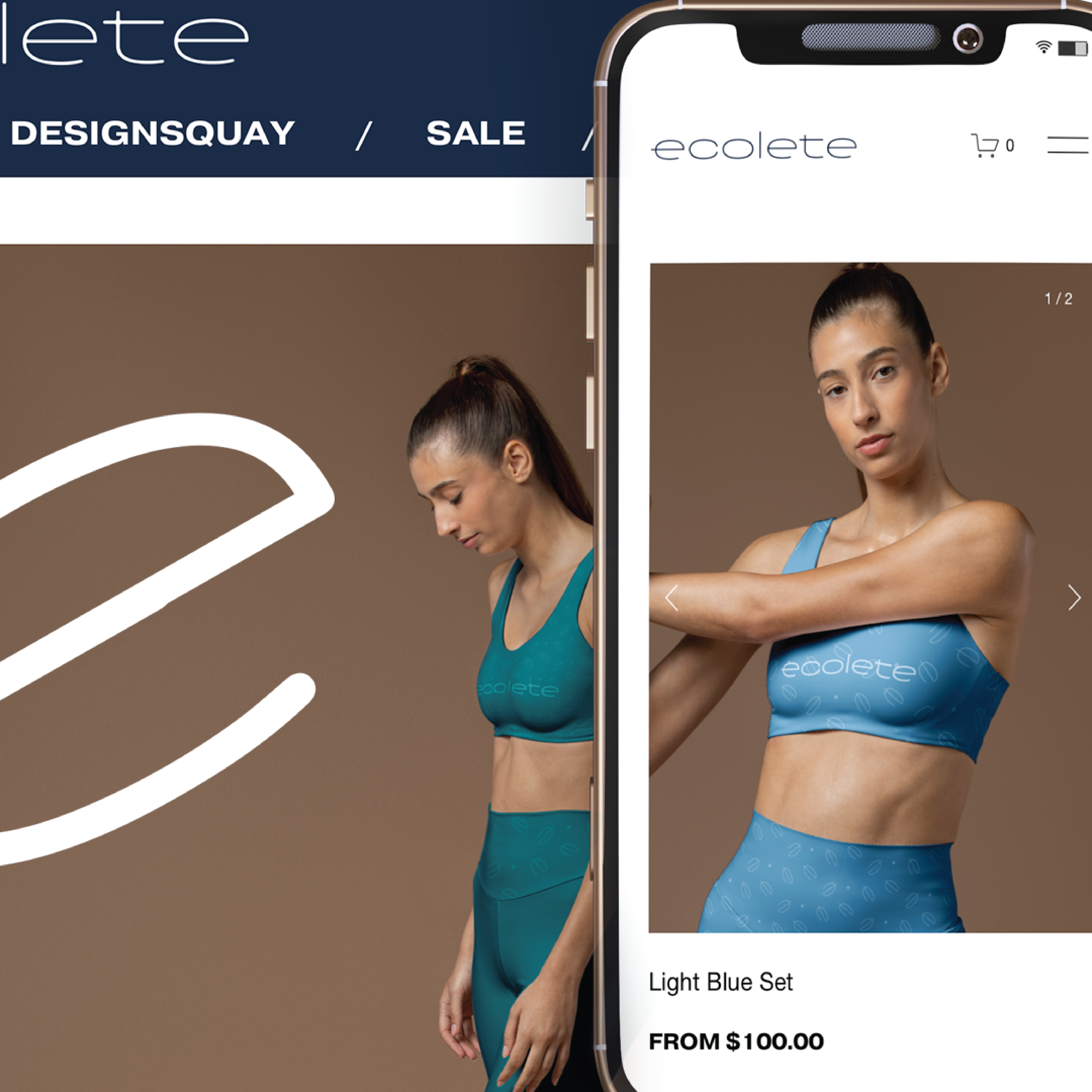
From there, I began building the visual identity around that balance. The logo, colors, typography, photography, and brand applications all needed to feel connected to fitness while still carrying the more thoughtful, environmentally conscious side of Ecolete.
Building the Brand
Finding the right balance between performance and sustainability.
One of the things I wanted to avoid was making Ecolete feel like every other fitness brand. I still wanted it to have energy and confidence, but I also wanted there to be a softer and more thoughtful side to it. That balance became the foundation for how I approached the identity.
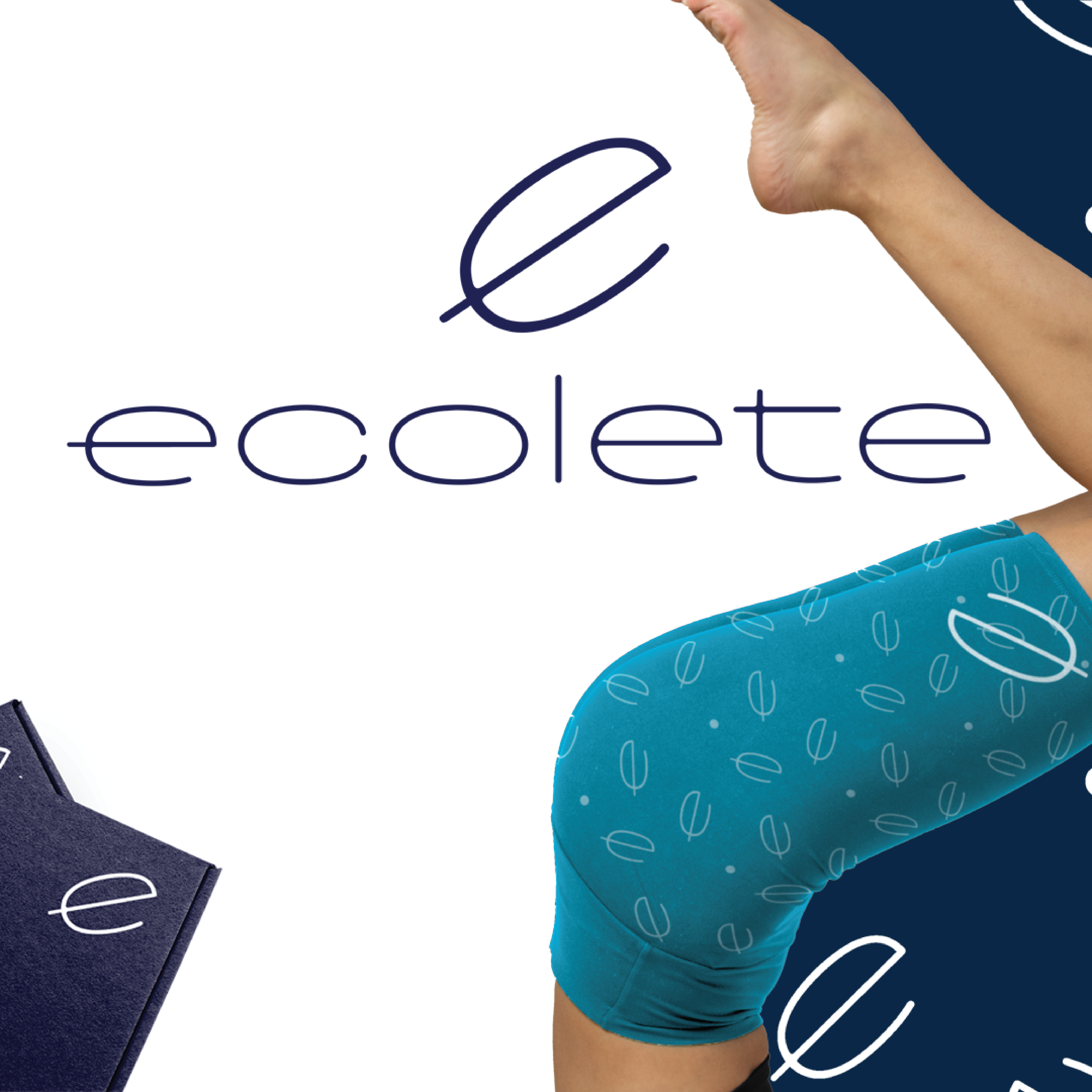
Creating a mark that could move with the brand.
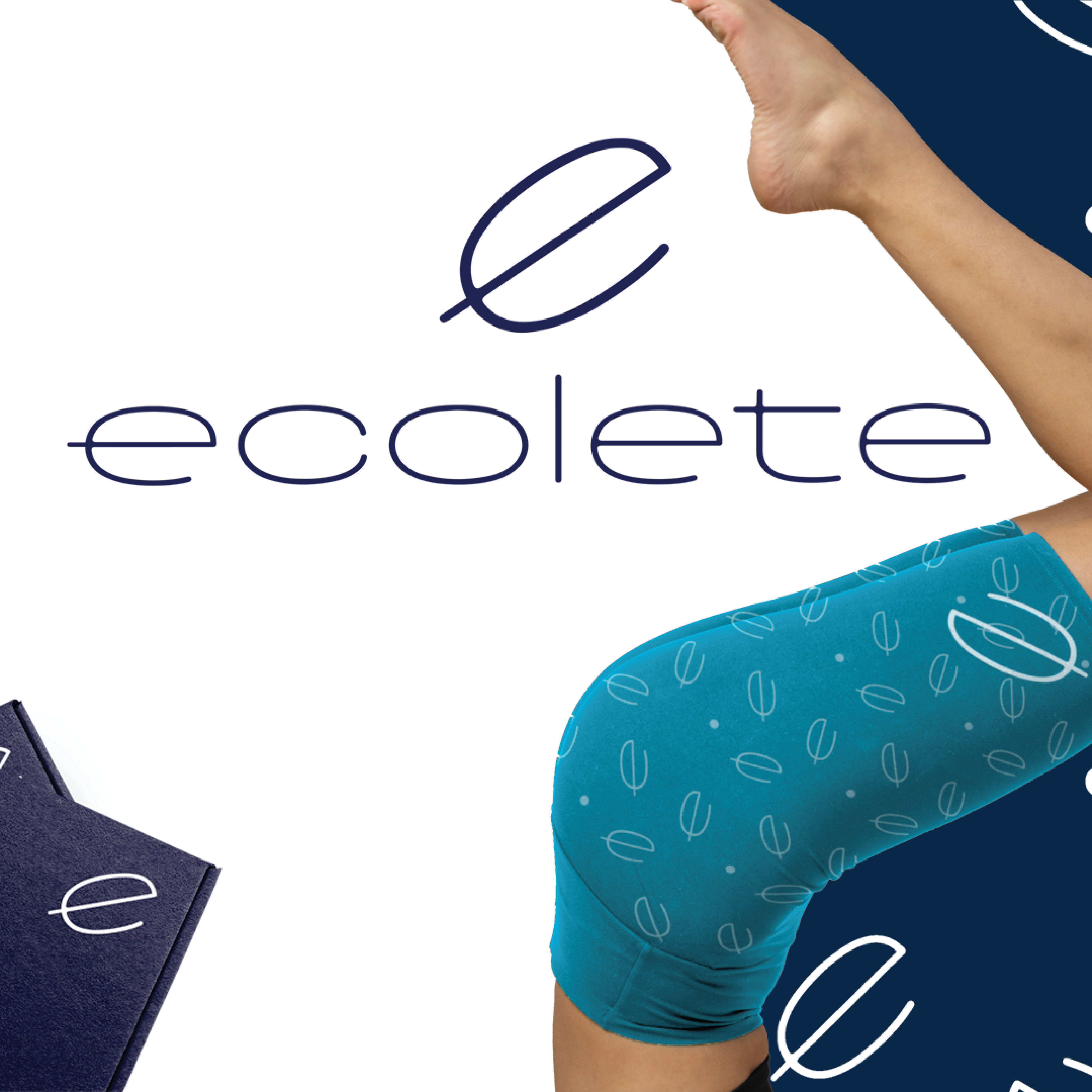
The logo was one of the first pieces I worked through. I wanted something simple enough to sit naturally on clothing, packaging, or advertising without losing its personality. It helped set the direction for the rest of the identity and gave me a strong starting point for building out Ecolete.
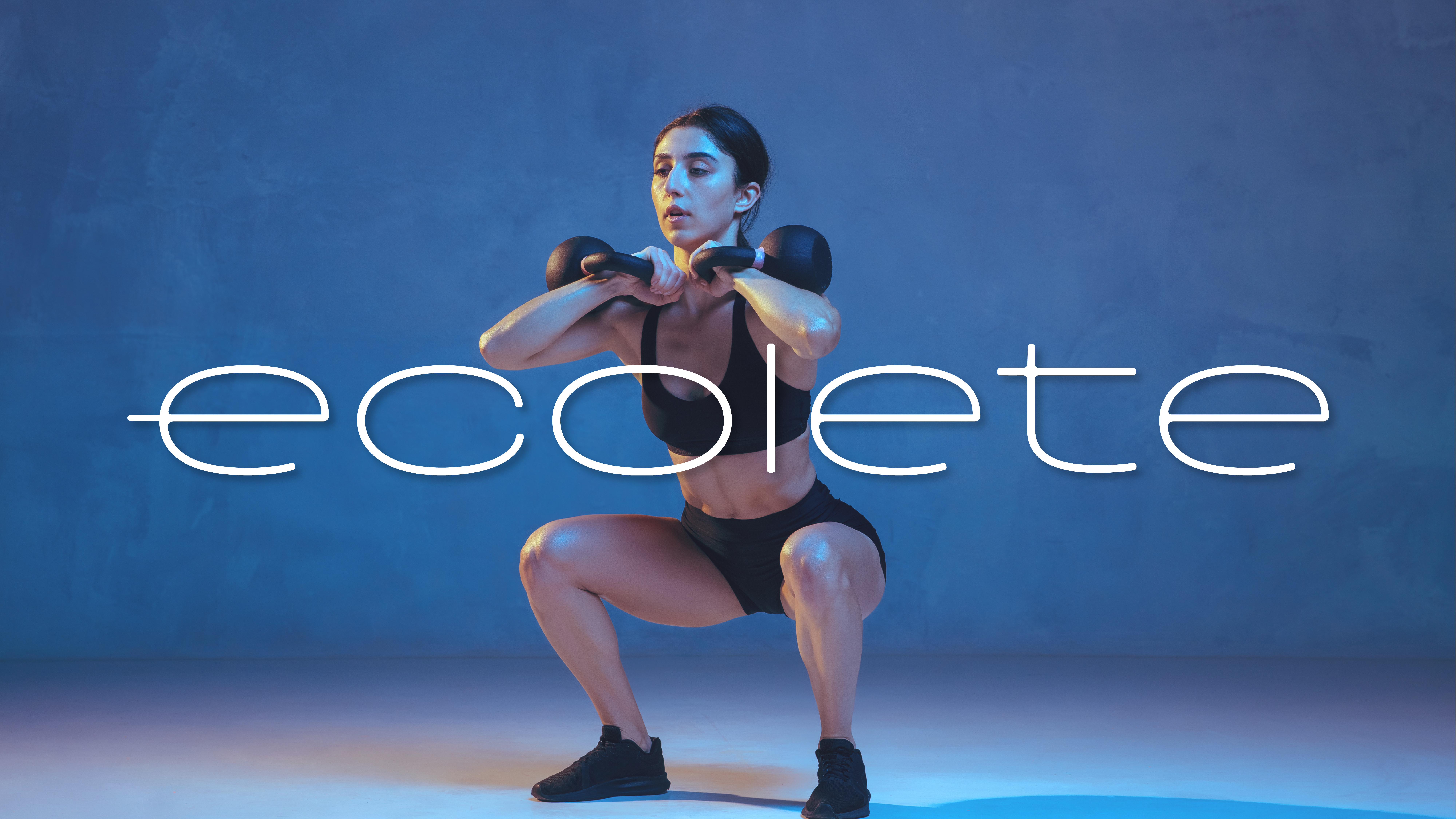
Giving the idea a personality.
This was where Ecolete started to feel like an actual brand instead of just a logo. I began thinking more about how it should speak, how it should look around athletic imagery, and how the environmental side of the concept could come through without feeling forced.
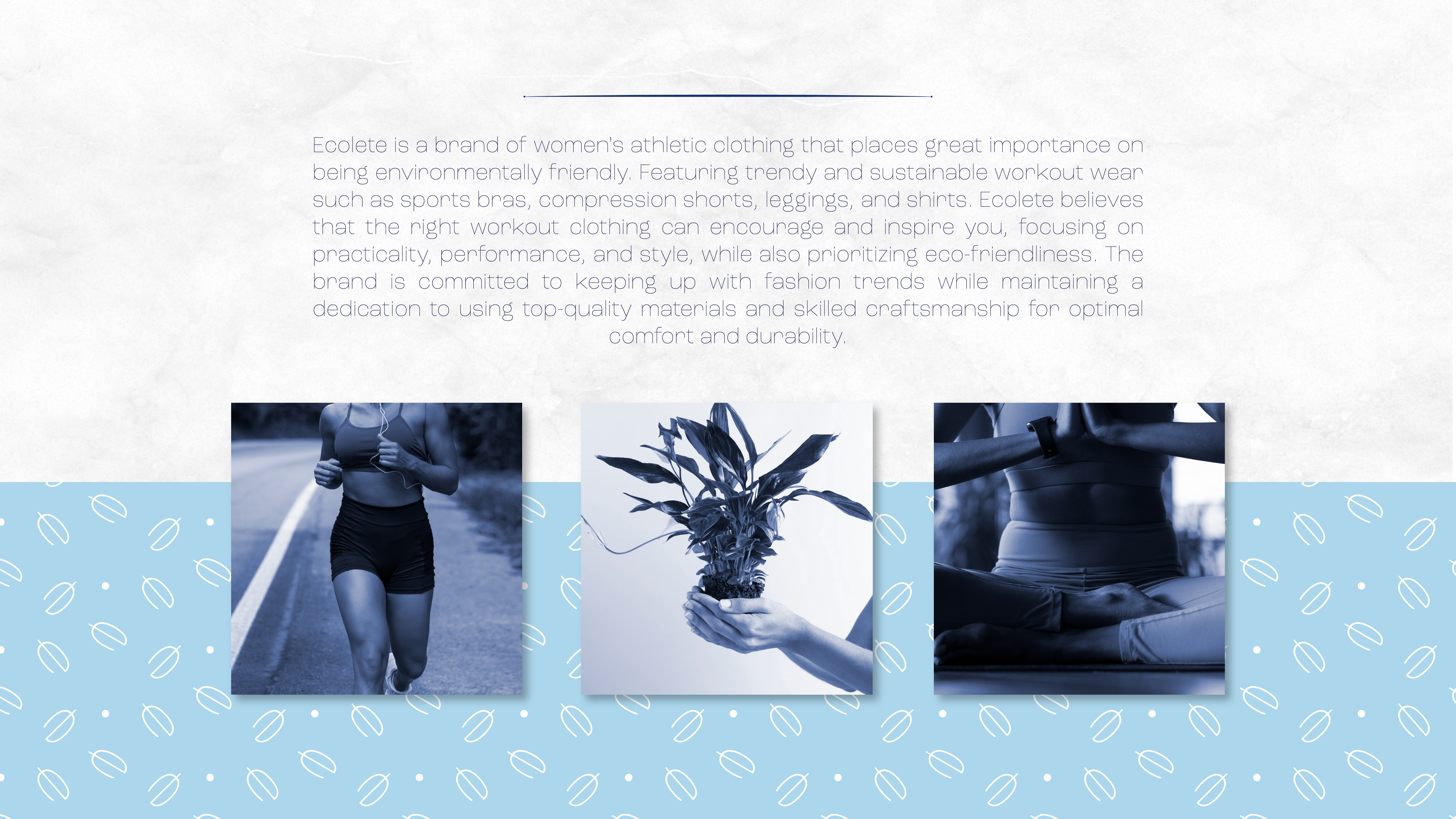
Keeping the environmental idea part of the whole identity.
I didn't want sustainability to feel like a separate message that was added at the end. I wanted it to be something you could feel throughout the brand. The colors, imagery, messaging, and overall direction were all chosen to help Ecolete feel more thoughtful while still clearly belonging in the activewear space.
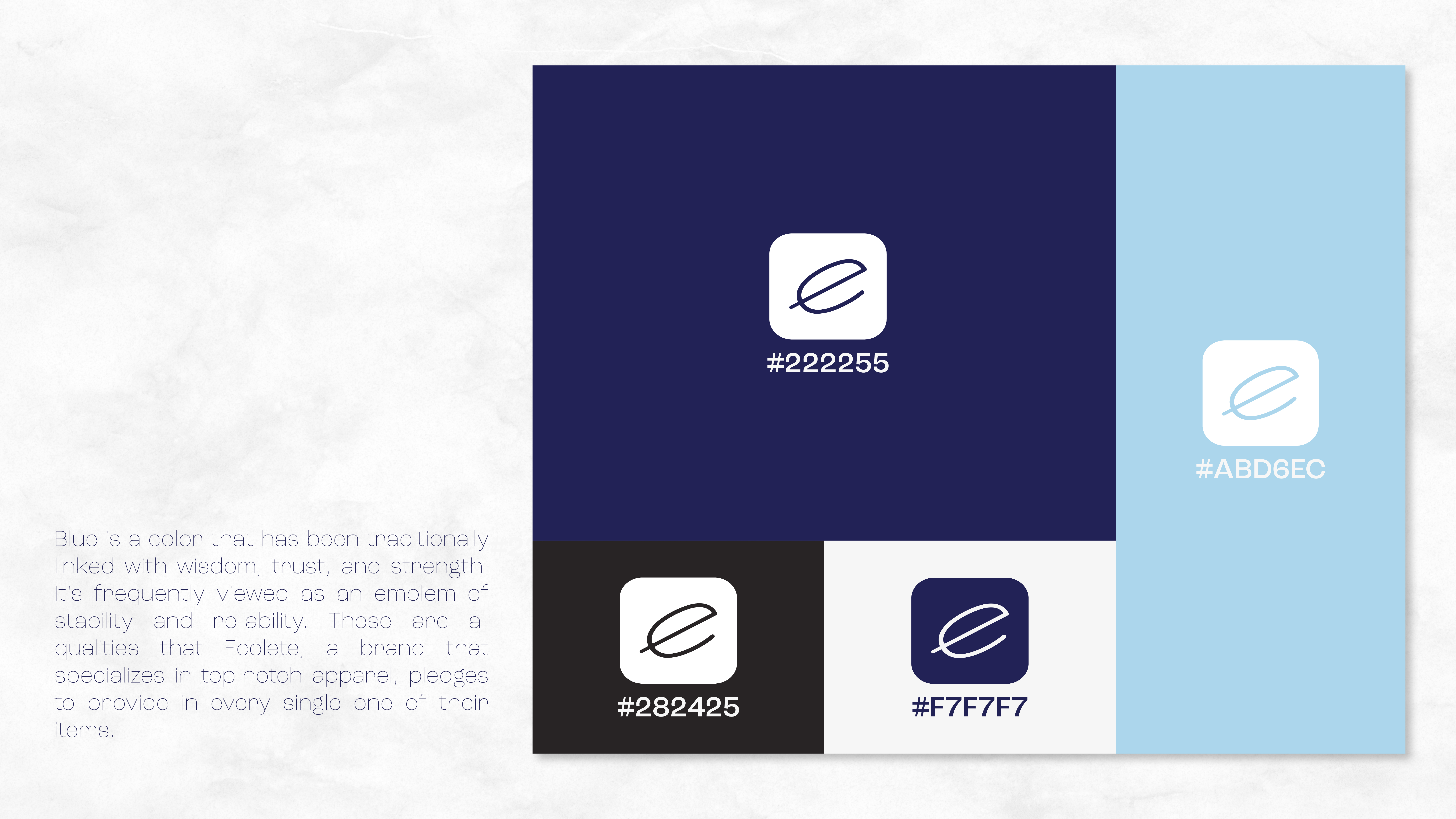
Using blue to give the brand a sense of strength and trust.
Blue became an important part of the identity because it naturally carries ideas of trust, stability, strength, and reliability. Those qualities felt right for Ecolete because I wanted the brand to feel dependable and performance-focused. At the same time, the blue gave the identity a clean and confident look that worked well alongside the athletic imagery.
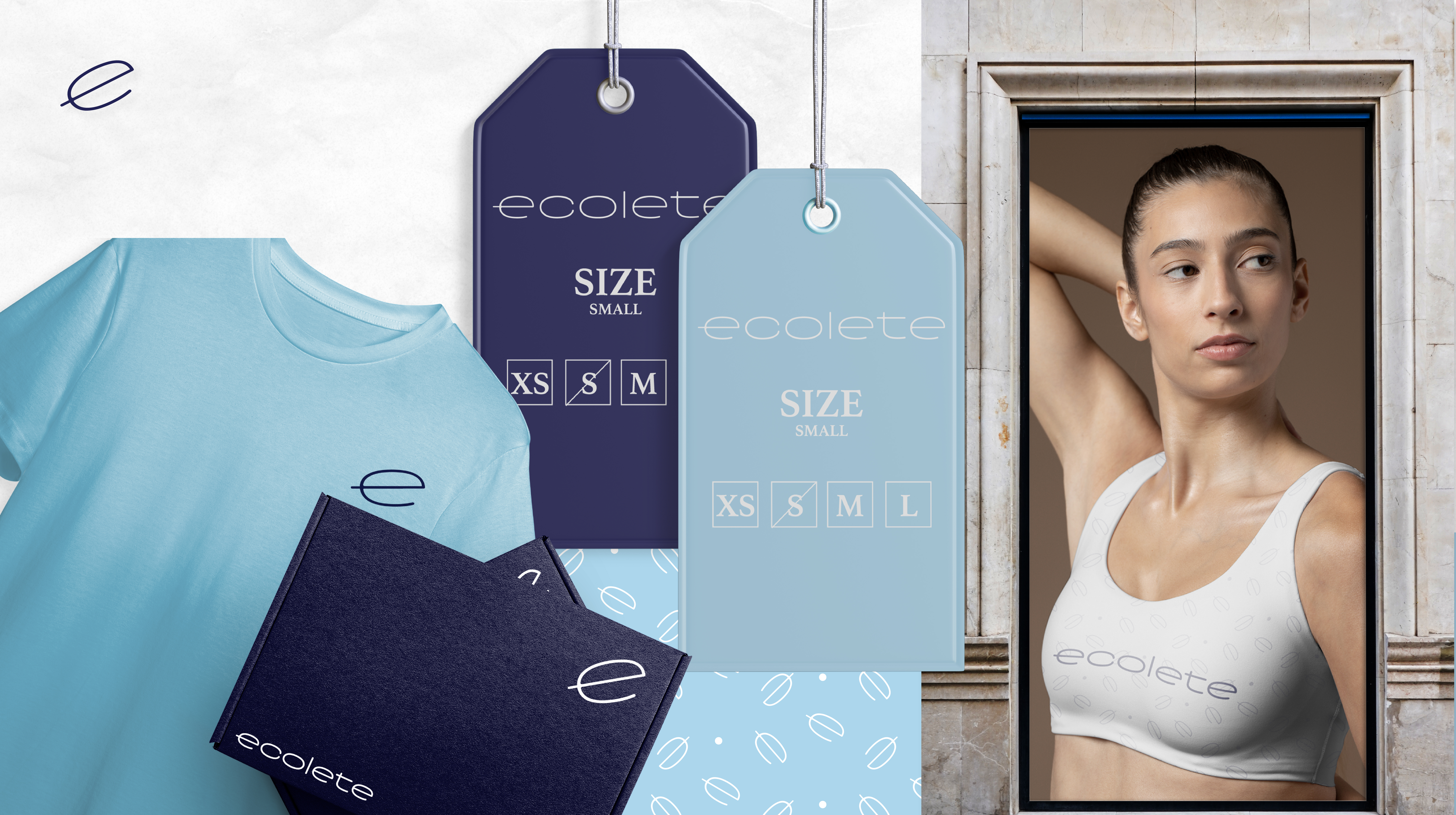
Seeing how the identity could live beyond the logo.
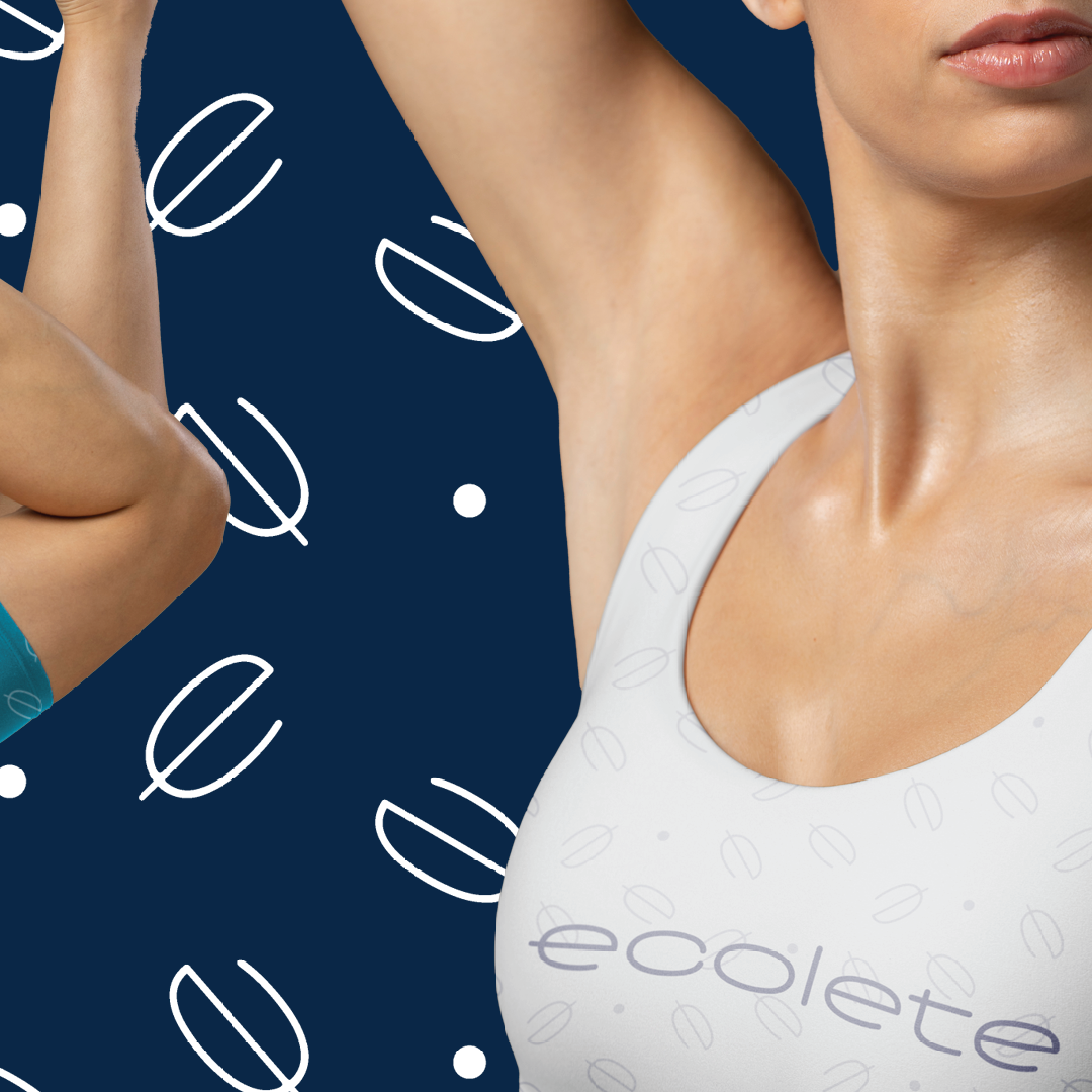
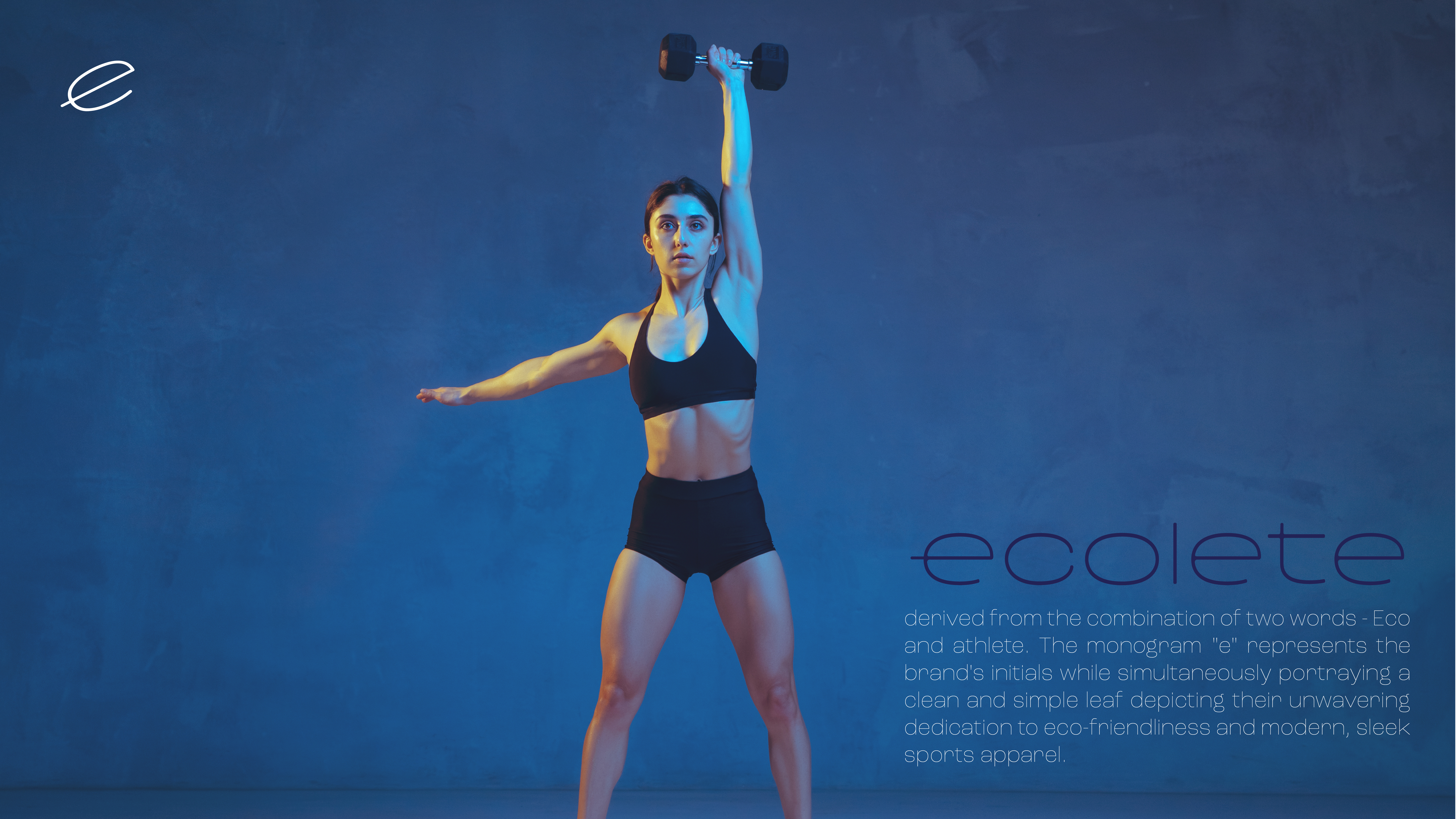
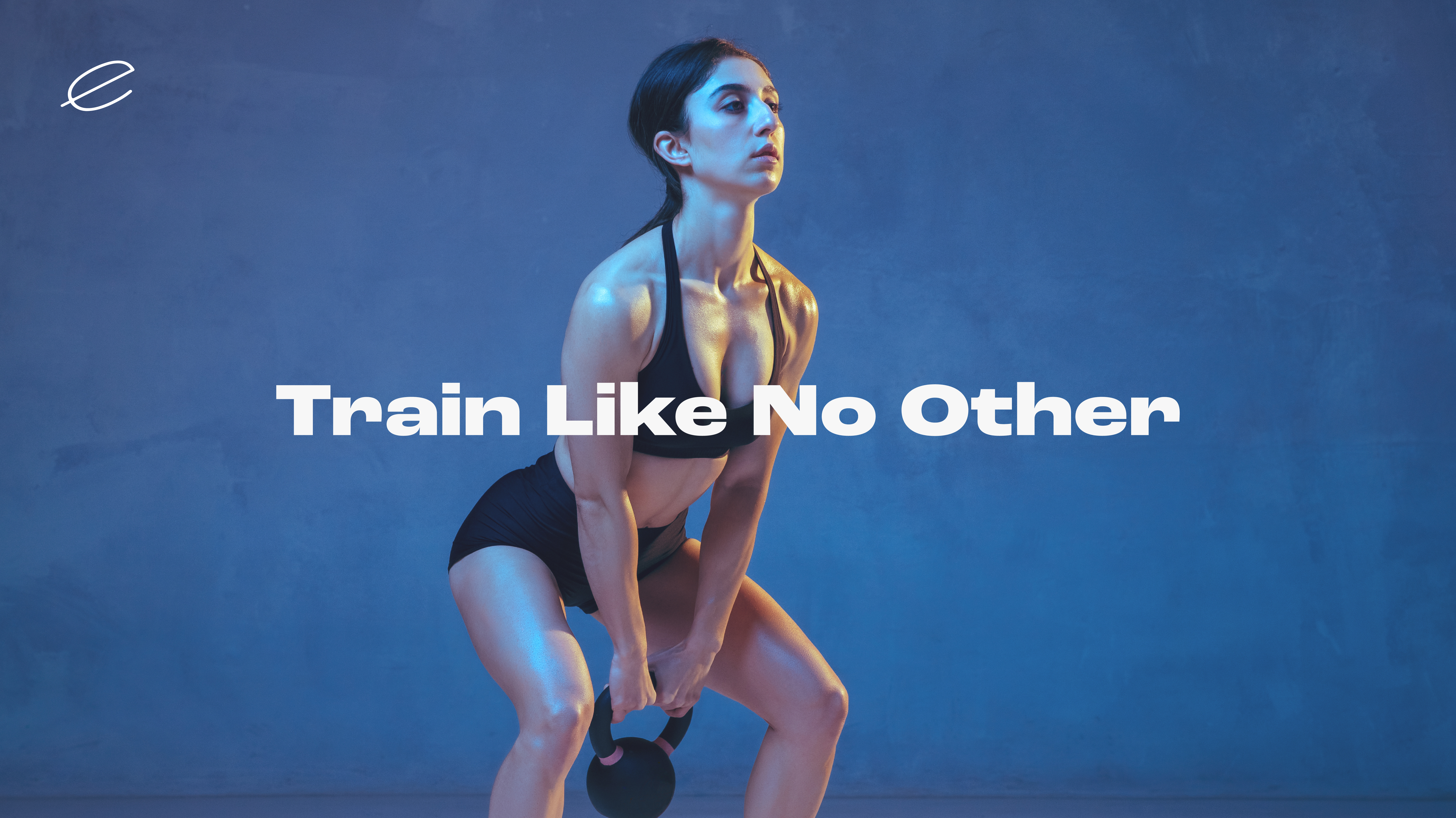
Once I had the main direction figured out, I started applying it to different layouts and athletic-focused visuals. This was where I could really see how the logo, typography, color, and photography worked together and whether the identity still felt consistent from one piece to another.
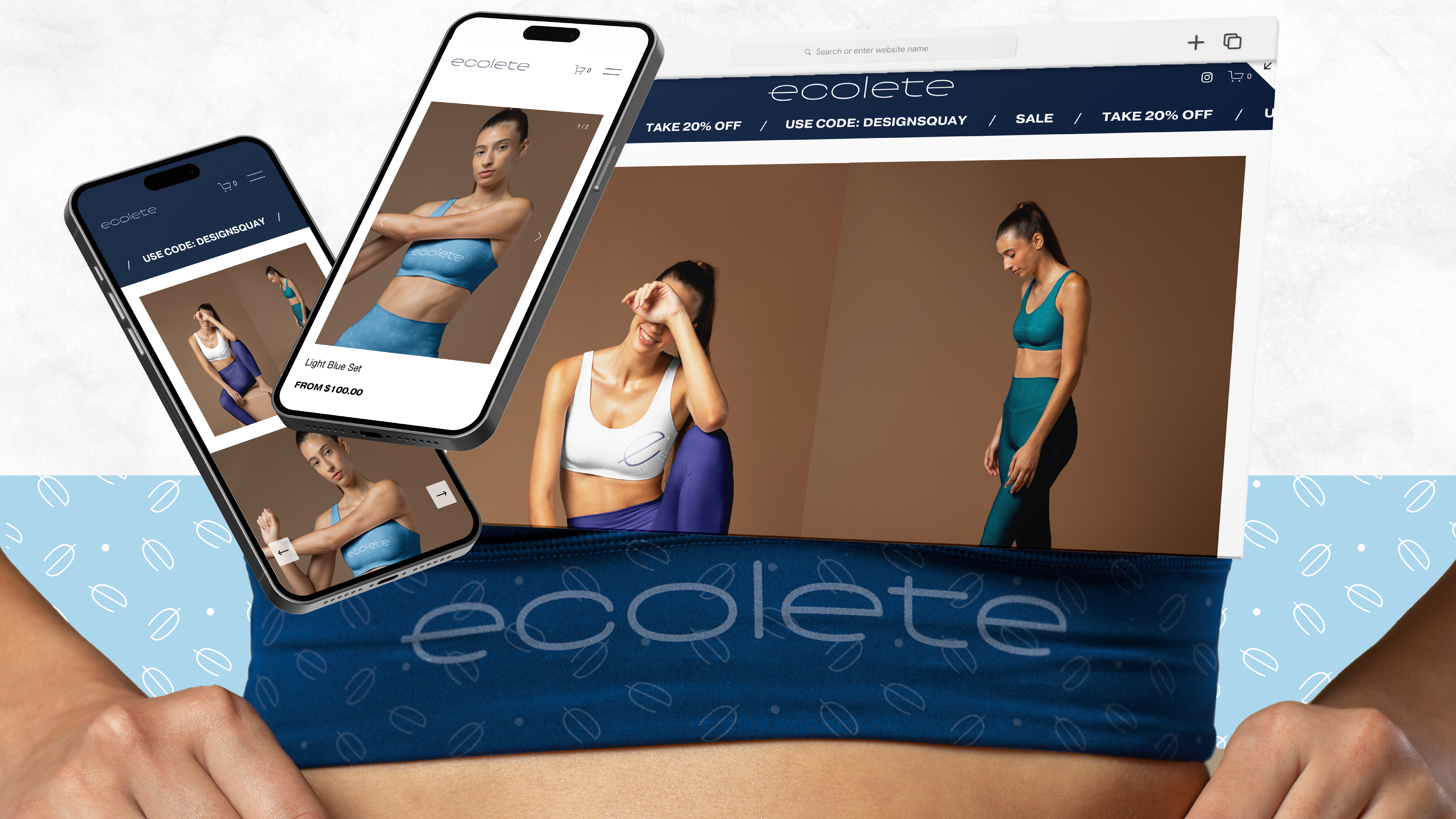
Keeping the audience in mind while building the brand.
Ecolete was always imagined specifically for women who are active, so I wanted the art direction to feel confident and stylish without losing the performance side of the brand. I tried to create something that could feel at home in the gym while still fitting naturally into an everyday lifestyle.
Making quality part of the sustainability story.
I also wanted Ecolete's environmental side to go beyond just looking “green.” Part of the concept was the idea of choosing quality and durability over disposable fashion. That connected naturally back to the blue palette and the sense of reliability I wanted the brand to communicate.
Bringing everything together into one identity.
By the end of the project, Ecolete had become a full brand concept built around women's fitness, environmental awareness, and dependable performance. The final identity brings together the logo, blue color palette, typography, photography, messaging, and applications in a way that feels consistent without becoming too rigid.